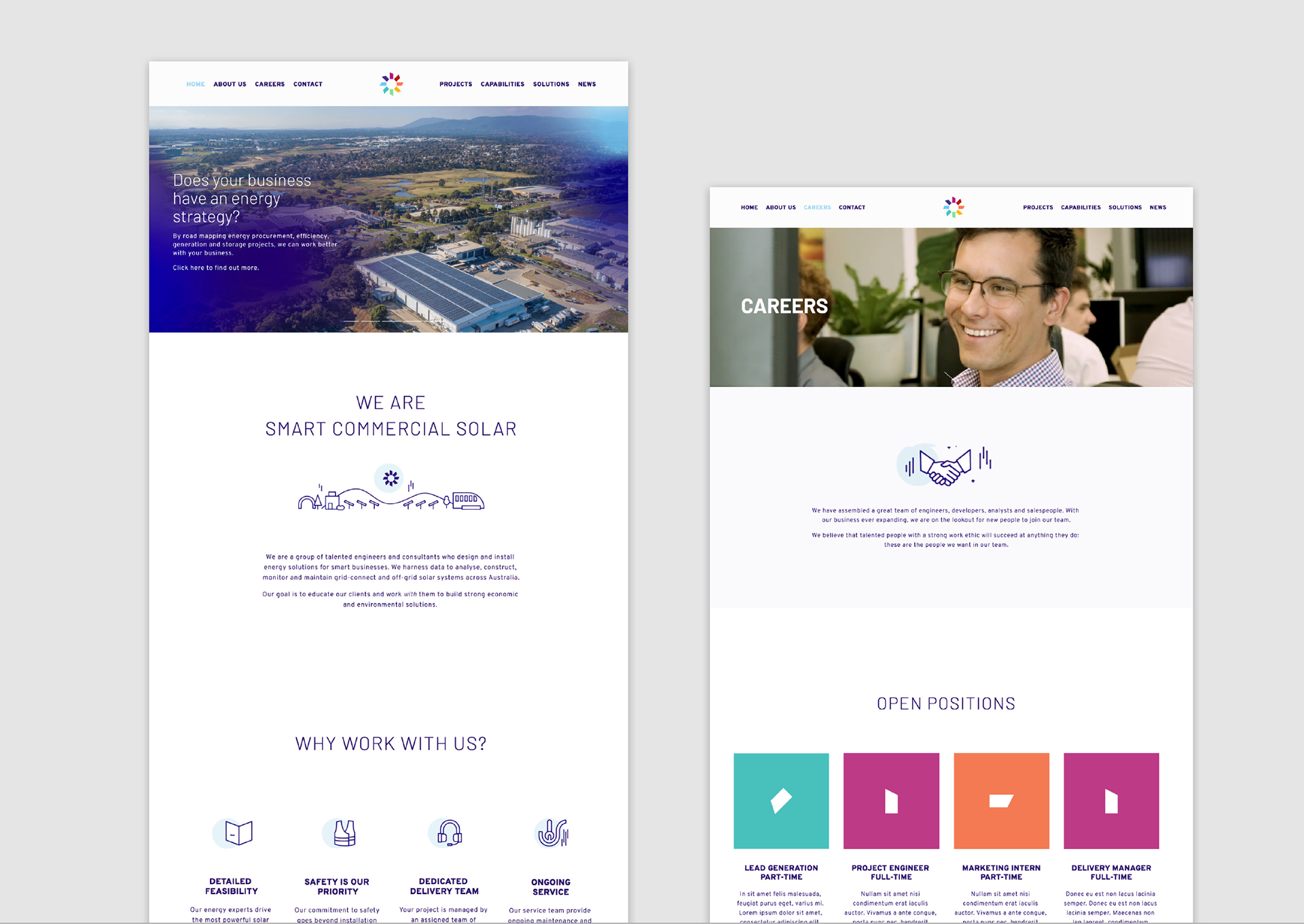
Smart Commercial Solar partners with some of Australia's biggest companies, delivering huge energy savings and success towards environmental targets. This project represents a long-term relationship whereby a strong, capable aesthetic was paired with a friendly and sunny tone. The brand was designed to appeal to an audience who wants to deal with good people that know what they're doing, in an industry where a lot of trust has dissolved from a few bad apples.

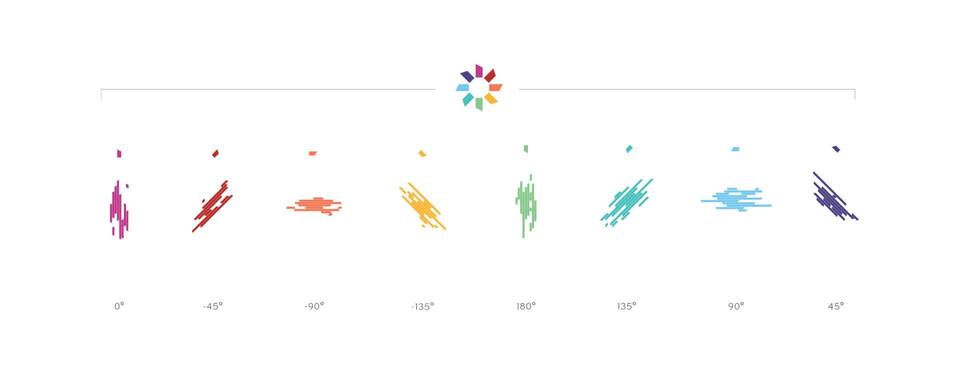
There was brand equity in the existing sun-spin logo. For this reason the old logomark was retained but tweaked with more considered spacing and a new palette of colours that better represent the Smart vision.
A new capitalized logotype was paired with this motif — intentionally futuristic and sleek in its design. A broader typography style was set for use within the brand in conjunction with this.
Read more about my creative and strategic considerations for the Smart Commercial Solar brand here.


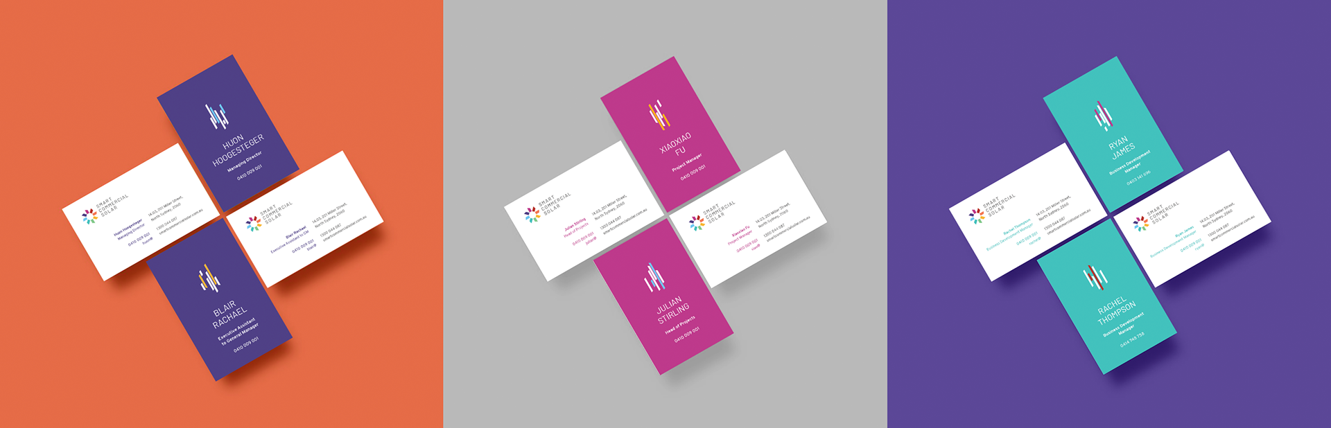

A well-considered system for company business cards that personalises each design according to the team and position of each staff member.
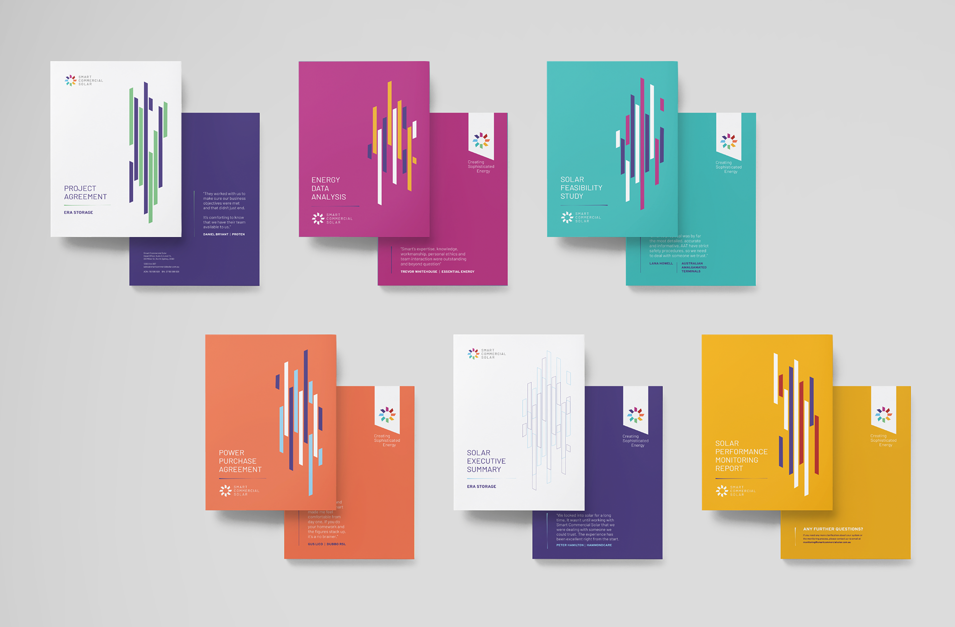
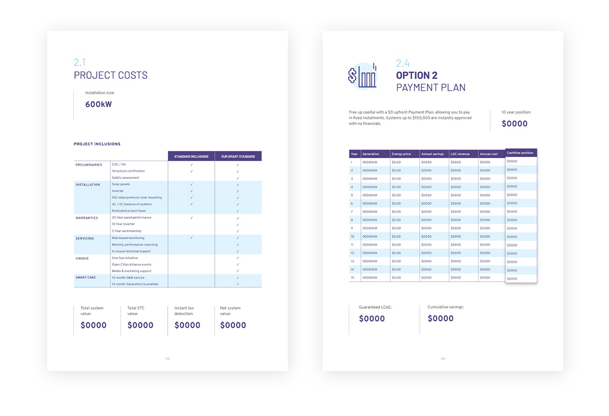
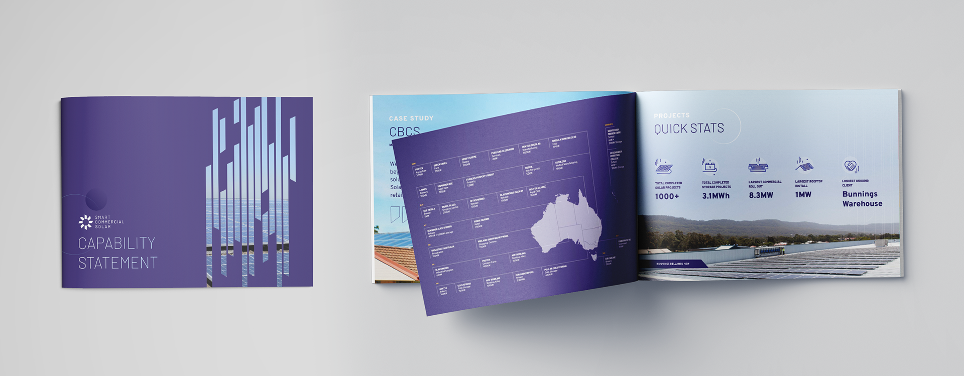
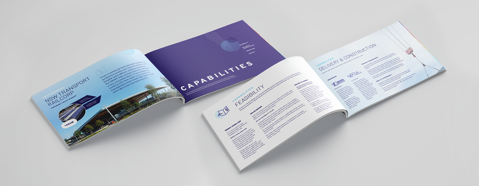
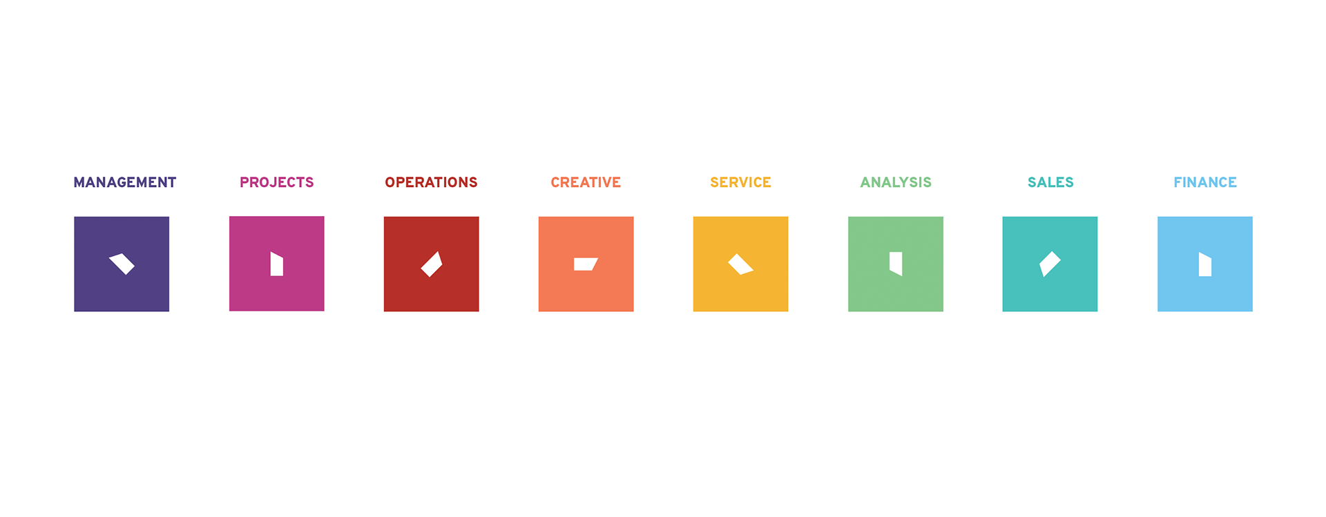
A similar system that brands each key document in the consumer journey by utilizing a variation of the panelled graphic and the colour scheme of the related team.

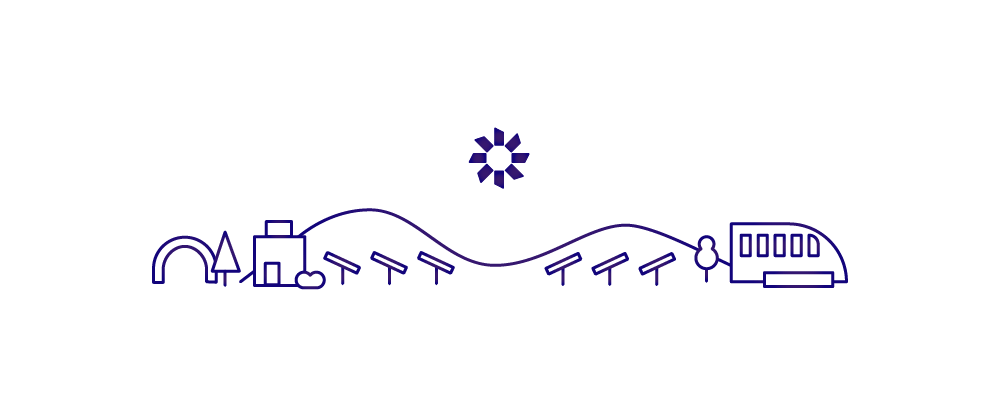
Many opportunities for simple animation to elevate and humanise the communication in small ways.